

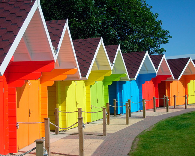
What does color psychology mean? Why are people more relaxed in green rooms? Why do weightlifters do their best in blue gyms? Colors often have different meanings in various cultures. And even in Western societies, the meanings of various colors have changed over the years. But many researchers have generally found the following to be accurate.
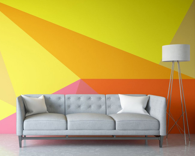
If you like the idea of using color to create an emotionally healthy home, color consultants say you should first consider the primary function of each room. Next, pick a predominant color. Although it can’t be proven scientifically, color consultants say some hues work better than others at encouraging certain activities.
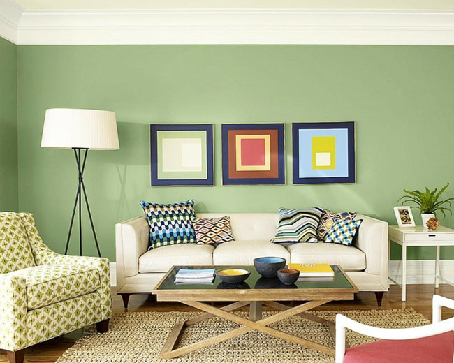
Warm tones like reds, yellows, oranges, and earth tones like brown and beige often work well in both the living room and foyer because they are thought to stimulate conversation. These are colors that encourage people to sit around and talk. You feel the warmth, the connection with other people.
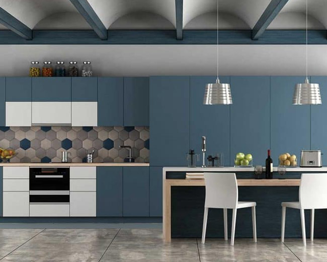
Color consultants say that if you have fond memories of spending time in the kitchen when you were a kid, it might make sense to recreate the color scheme in your grown-up kitchen. If you grew up in a blue-and-white kitchen and have great memories, blue and white may be the best colors for you and your family.
If there is no particular paint scheme you remember fondly, reds and yellows can be great colors in the kitchen and the living room and foyer. But watch out if you are watching your weight: in addition to stimulating conversation, color consultants say that red may prompt you to eat more, if only subtly. So if you are on a diet, you might want to keep red out of the kitchen.
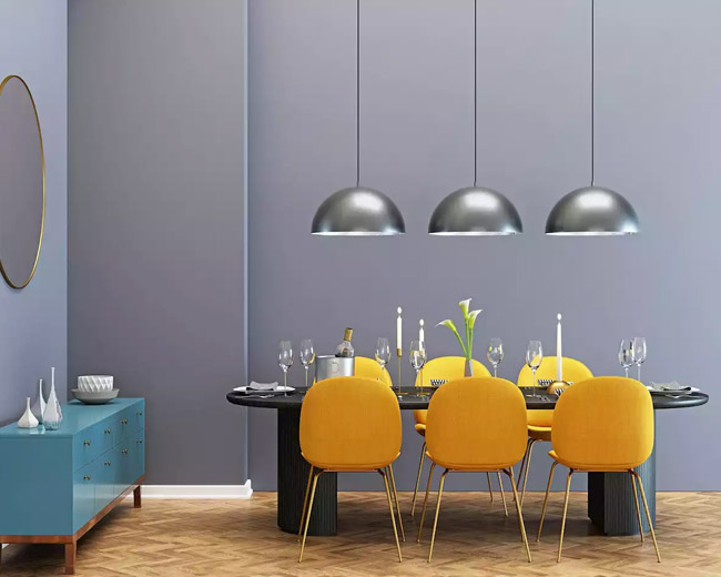
Because it is stimulating, red decor can be great for a formal dining room. In addition to encouraging conversation, it whets the appetites of your guests. If your dining room is red, people may think you are a good cook.
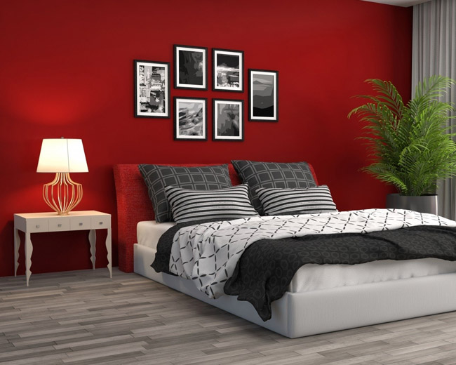
The bedroom is where you go to relax and reconnect with your partner. Cool colors — blues, greens, and lavenders — can be great choices because they are thought to have a calming effect. The darker the hue, the more pronounced the effect is believed to be. Reds tend to increase blood pressure and heart rate and stimulate activity. Blue does just the opposite. That’s why we think of it as calming. What if your teenager has a few ideas about how to paint his or her bedroom? In the name of family harmony, it probably makes sense to let your teen pick the paint — within reason.
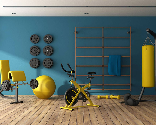
Reds and oranges can help you move. But they can also make you feel hot. For this reason, blues and greens may be better choices here. In addition, Yellow-greens and blue-greens may be the best choices because, in terms of color psychology, they are ” happier.”
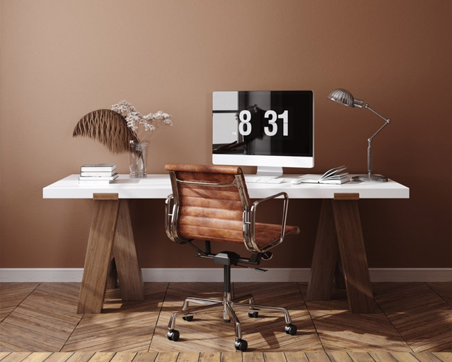
The game’s name here is productivity: the faster you complete work-related tasks, the more time you will have to spend enjoying yourself with family and friends. And color consultants agree that green can be a great choice for a home office. Green is the color of concentration. It’s one of the best colors to be surrounded by for long periods.
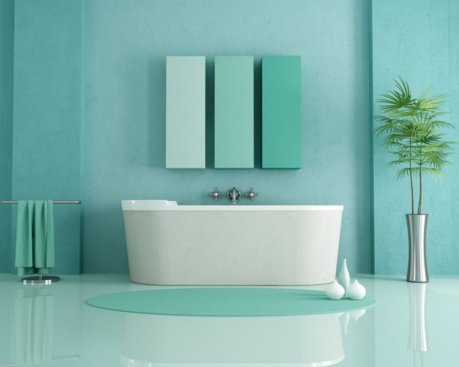
Whites and warm colors have always been popular choices for bathrooms, in large part because they connote cleanliness and purity. Nowadays, the bathroom is a place to wash up and as a private retreat for relaxation and rejuvenation. As a result, most people feel comfortable with blues and greens and turquoise because these colors give a sense of being clean and fresh — and calm.