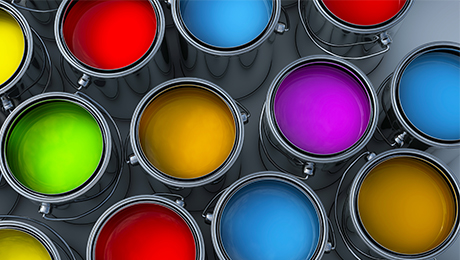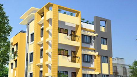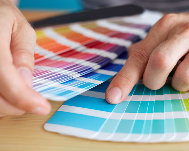
How do you decide what colour to use when you start painting, when there are so many. The room is painted, the people and their personality all effects and on fluencescolour and how the colour affects you.
Cool Colors
Colors like blue, green, and purple (violet). These colors evoke a cool feeling because they remind us of things like water or grass. It gives an impression of calm and creates a soothing impression.
Colors like blue, green, and purple (violet). These give an impression of calm and create a soothing impression.
-
Shade 1
-
Shade 2
-
Shade 3
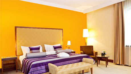
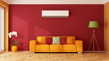
Warm Colors
The colors red, orange, and yellow are considered warm colors because they are fire colors. These hues are also said to advance, meaning they appear to come forward, making the walls feel closer. Thus, they can make a room feel cozy when used in decorating.
-
Shade 1
-
Shade 2
-
Shade 3
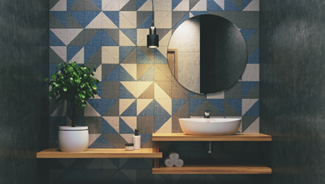
Color Harmony
Harmony is pleasing to the eye. It engages the viewer and creates an inner sense of order, a balance in the visual experience. Conversely, when something is not harmonious, it’s either boring or chaotic, resulting in the detachment of the viewer. Color harmony delivers visual interest and a sense of order.
-
Shade 1
-
Shade 2
-
Shade 3
Neutral Color
In the context of painting and interior design, neutral means without color. Neutrals such as beige, ivory, taupe, black, gray, and shades of white appear to be without color, but in many applications these hues often have undertones. Be aware of these underlying tones as you match colors or choose paint. For example, beige might have an undertone of pink, tan, gold, or gray, which makes up greige, a newer and favored neutral. White might be slightly ivory, yellow, bluish or peachy. Neutrals can be used in decor in two basic ways—either as a soft, neutral only, quiet look, or as background colors for dramatic accents.
-
Shade 1
-
Shade 2
-
Shade 3